MY CHILD CARE PLAN
Child Care Location Finder
ABOUT THE PROJECT
The goal for this project was to refine the mobile experience of the location search, making it more intuitive while respecting the requirement to avoid displaying the exact locations of 'Home' childcare facilities. Additionally, we rethought the filter system and improved the way selected filters are displayed to enhance user experience.
My Child Care Plan (MCCP) is an online platform designed to help parents and caregivers in California easily find childcare options based on their location. Key requirements included developing an interactive map that highlights the exact and general locations of these facilities, as well as providing a list view for easier navigation. Additionally, we reimagined the filter system to improve the selection process and ensure a seamless display of chosen filters.
MY ROLE
Lead Product Designer
TOOLS
Figma
PROJECT LENGTH
2 months
01.
Exploration & Discovery
Competitive Analysis
Since the project involved location approximation using a map interface, I wanted to explore and evaluate one of the most widely used mobile map experiences—Google Maps.
Google Maps
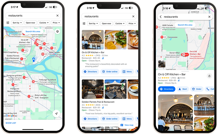
Summary & Takeaways for My Child Care Plan
User Friendly Interface & Intuitive Navigation
Google Maps excels in offering a clean, intuitive interface. The app prioritizes simplicity without compromising on functionality, allowing users to quickly search, get directions, and interact with map data. Features like pinch-to-zoom, smooth scrolling, and quick access to nearby places make the user experience seamless.
Search Precision & Auto-Suggestions
Google Maps is known for its highly precise search functionality. It offers auto-suggestions as users type, based on real-time data and user behavior, speeding up the search process and reducing errors.
02.
UX Design Process
Wireframes
Since the user flow remained the same, we focused on enhancing the pathway. Wireframes were created to refine the most effective approach.
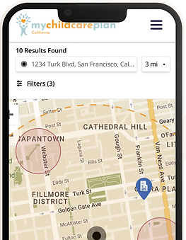
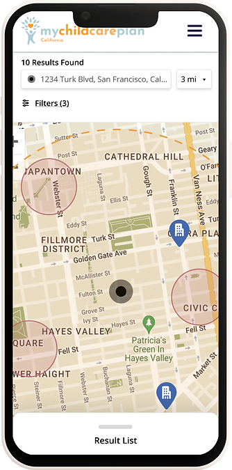
Mile radius selection
Allowing the users to customize the radius they are being shown results (see element 2).
1
Mile radius view
Added a mile radius visual representing the radius the user has selected. Users are still able to see results outside of the radius, this just provides a visual guide.
2
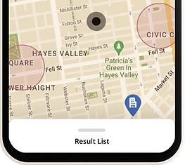
Pull up list view
One of the goals was to seamlessly incorporate the list view with the map view, something missing from the original design. Adding a pull up drawer for this was the design solution.
3
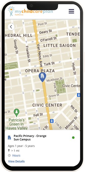
Card view
While some size restraints were present here, we were able to fit in all the necessary ‘quick glance’ information for the child care centres. Adding clickable CTAs for both centre hours and details which will take the user to the full centre details page.
1
Care type indicator
MCCP offers information on both Child Care Centres and Child Care Homes. We needed a visual way to represent which was which. A house icon was used for the homes, while a building icon was used for the centres.
2
Status Indicator
Another requirement for the card views was adding the status of these centres. Green = Accepting Referrals, Yellow = Waitlisting and Red = Not Accepting Referrals.
3
Selected pin
Much like Google Maps, the user can tap into any of the pin results on the map to hone in on that specific centre. Doing so will also bring up the centres card.
1
Info card
Tapping into a specific map tag will also bring up the centres information card for better visibility.
2
'Back' CTA
Allows the user to go back to the map / results view.
1
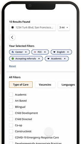
Filters that have been selected
Using tags, this clearly shows the user what filters they have already selected along with a quick way to clear individual filters.
2
Reset CTA
If the user wants to create a completely blank filter slate, this CTA will reset all filters to unchecked.
3
Filter categories
MCCP has a large number of filter possibilities that are all organized under these filter categories. This view allows they to side scroll through the categories and browse the filters under them.
4
03.
Final Designs
